Brand identity for
Logos Omilia Speech Therapist.
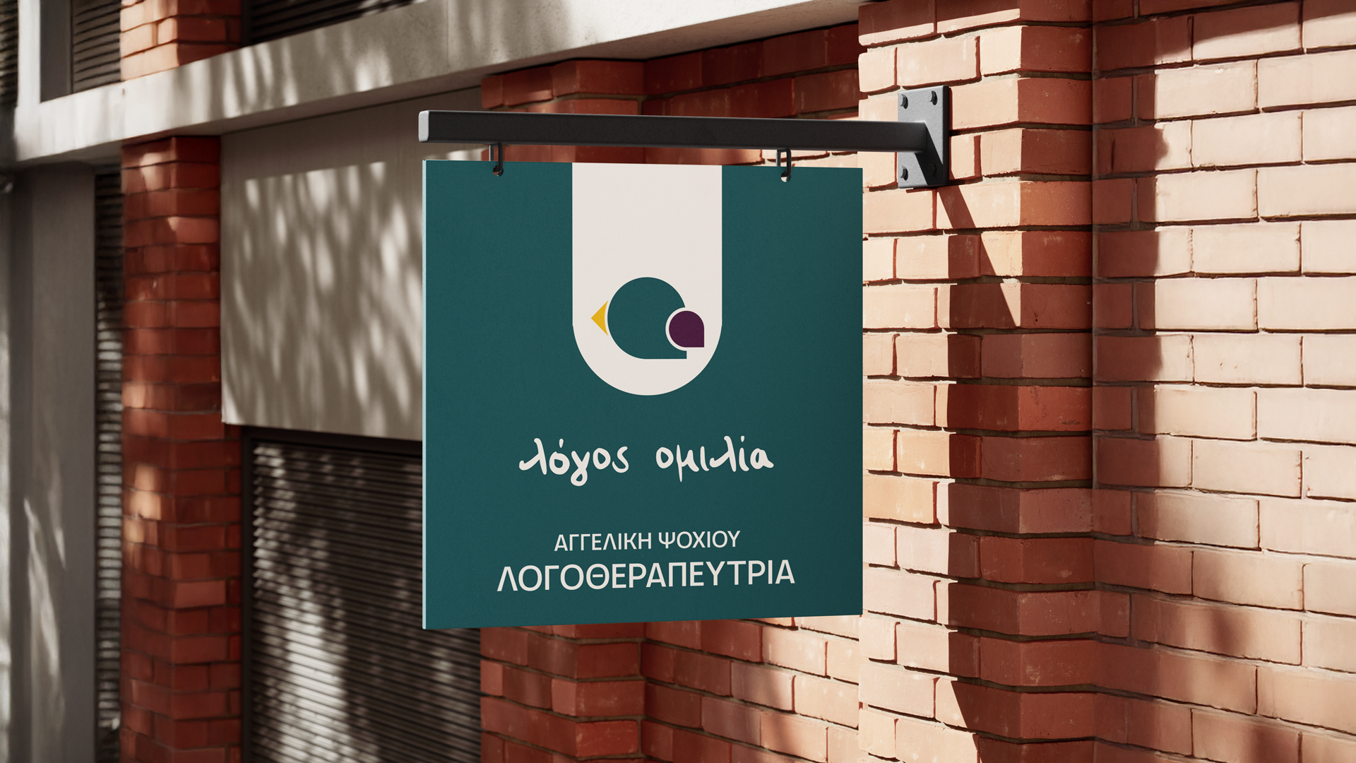
For this project, I was tasked with creating a brand identity for a speech and language therapist working with children and families. The goal was to strike a balance between warmth and professionalism — a visual language that feels welcoming for young clients, yet reassuring and credible for their parents.
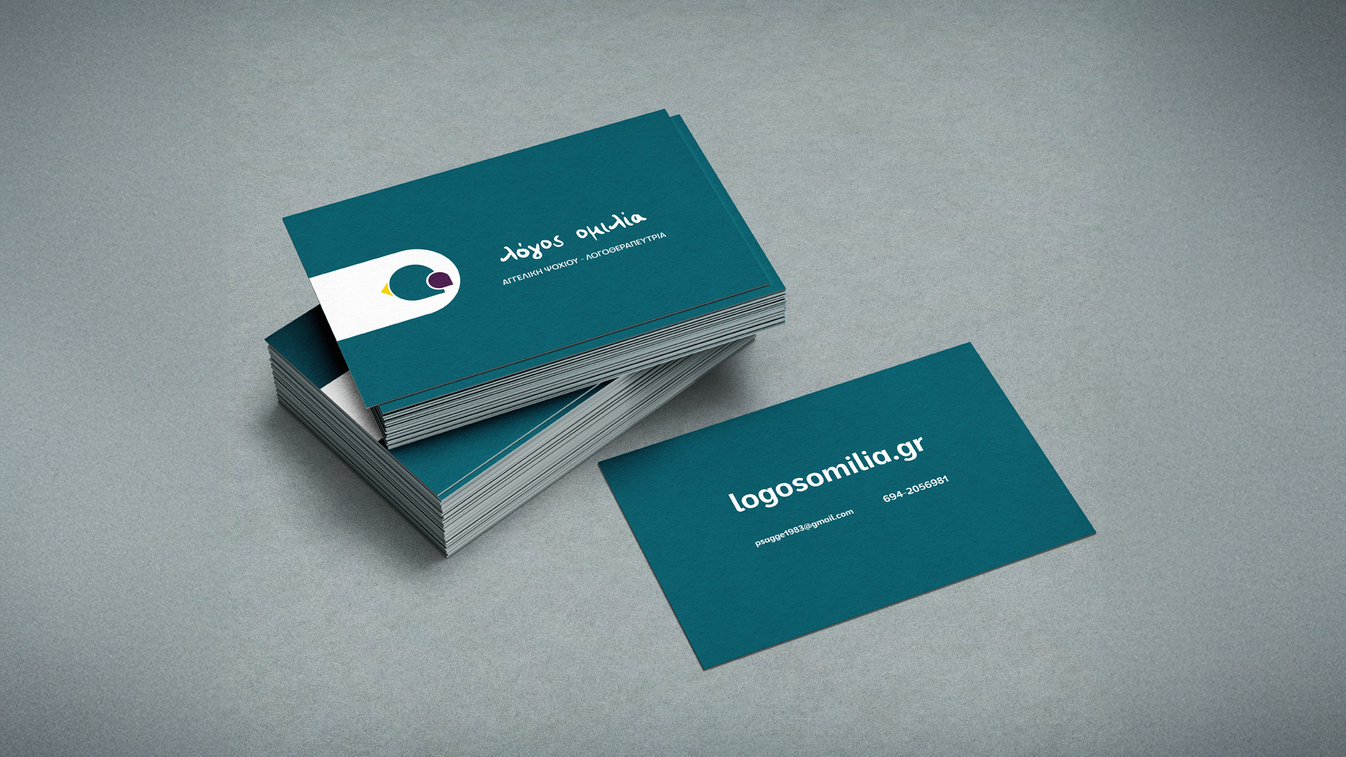
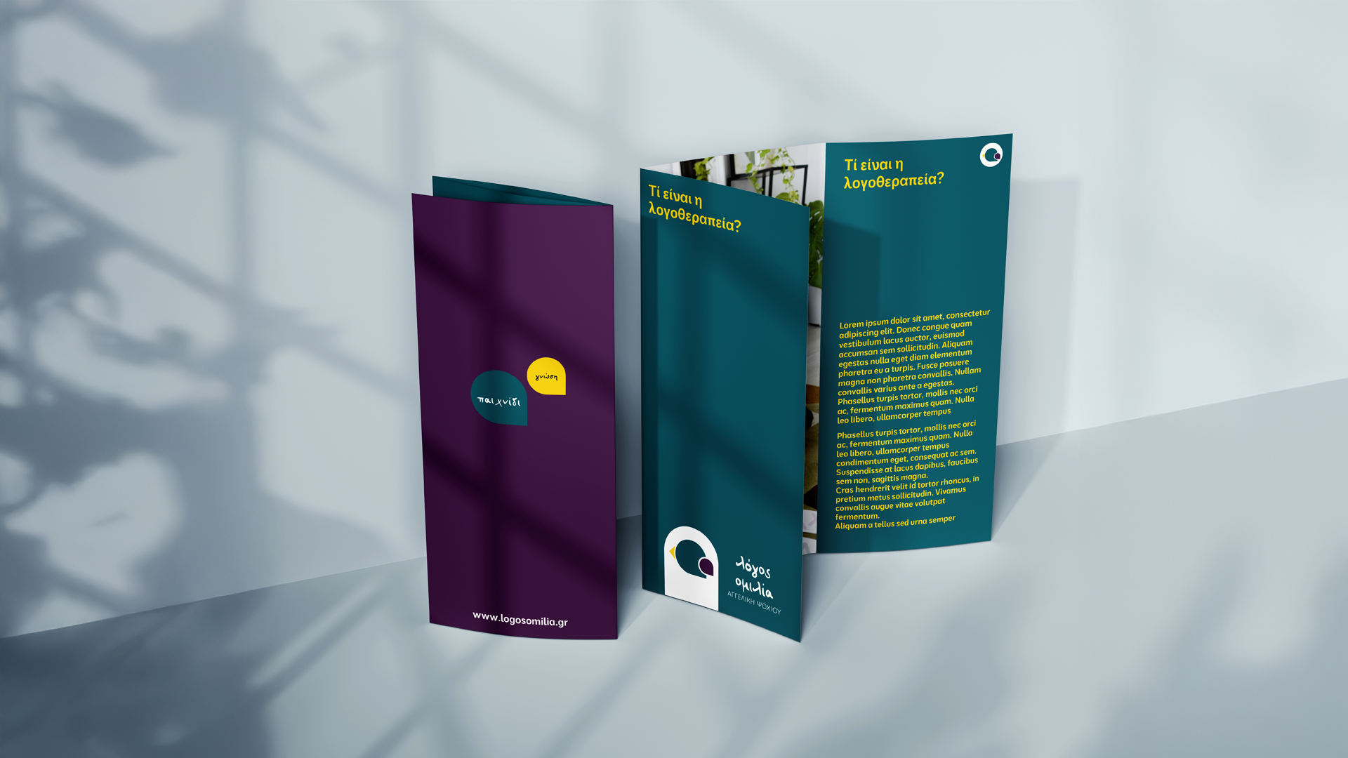
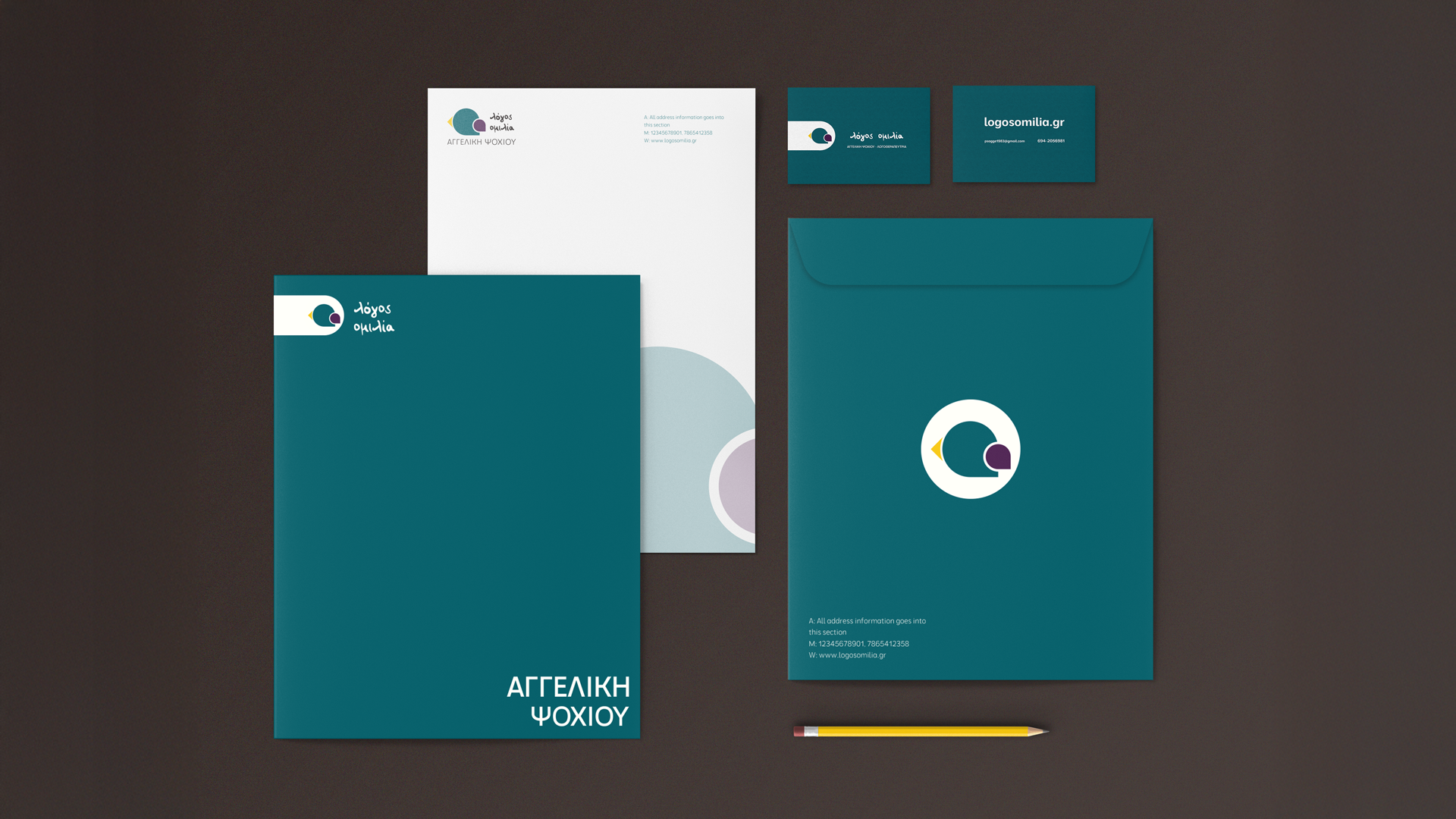
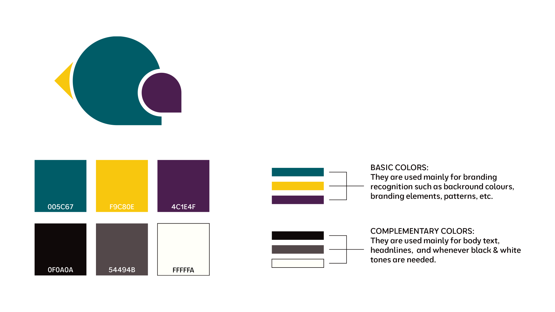
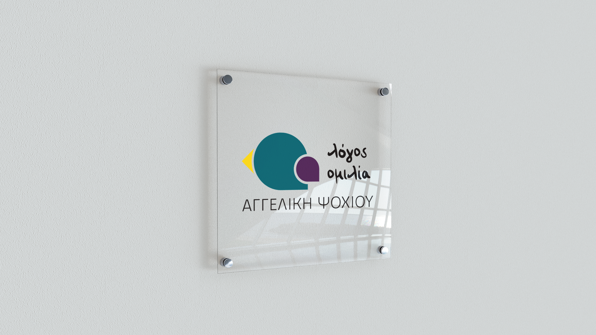
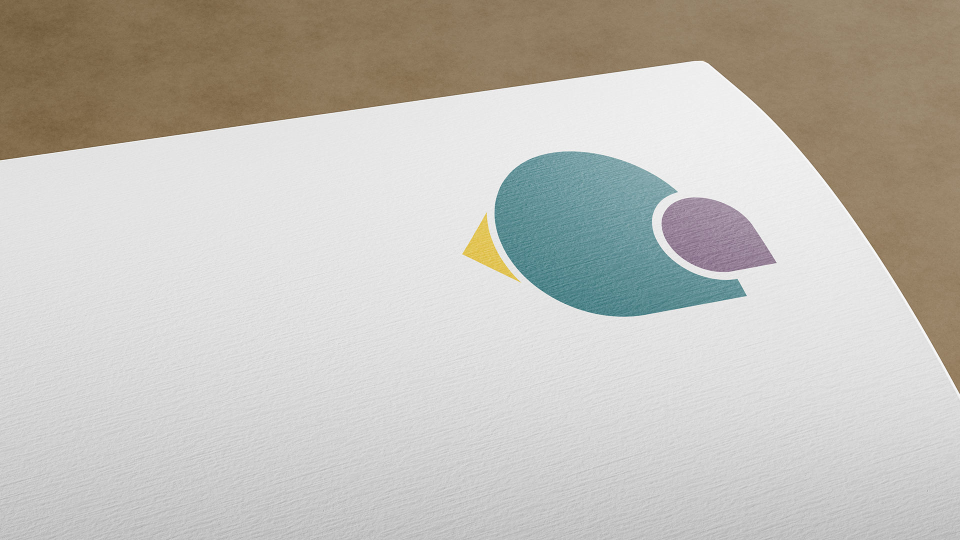
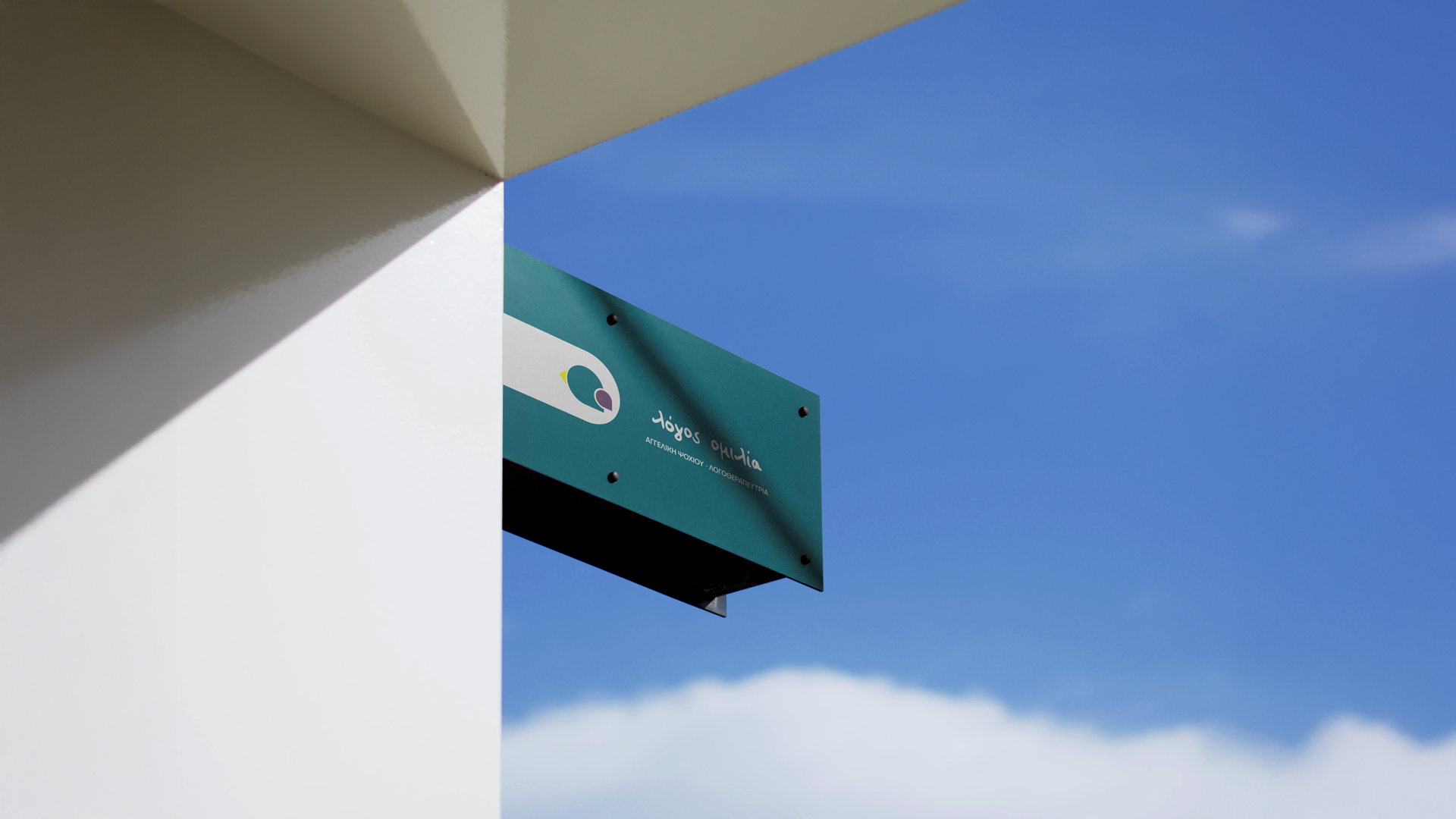
The final brand identity is playful, colourful, and approachable, while maintaining a sense of refinement and clarity. Soft shapes, friendly typography, and a harmonious palette work together to create a calm and supportive presence. The visual system is designed to reflect the therapist’s core values: connection, growth, and trust — helping to build an identity that feels both caring and confident.
Client
Logos Omilia
Sector
Health & Education
Service
Brand Identity & Web Design
Year
2025
Brand identity for
Logos Omilia Speech Therapist.
For this project, I was tasked with creating a brand identity for a speech and language therapist working with children and families. The goal was to strike a balance between warmth and professionalism — a visual language that feels welcoming for young clients, yet reassuring and credible for their parents.
The final brand identity is playful, colourful, and approachable, while maintaining a sense of refinement and clarity. Soft shapes, friendly typography, and a harmonious palette work together to create a calm and supportive presence. The visual system is designed to reflect the therapist’s core values: connection, growth, and trust — helping to build an identity that feels both caring and confident.
Client
Logos Omilia
Service
Brand Identity & Web Design
Sector
Health & Education
Year
2025
